
0 comment Monday, August 25, 2014 | admin
Whenever I read about global warming and the leaked emails, invariably mention is made of a "hockey stick." So what's all the hoopla about a hockey stick? What does it have to do with global warming, I wondered.
Most of the articles on global warming and climate-gate make for dense reading. They are not especially illuminating. Yesterday, though, I found an informative article, written in words I could understand.
The graph below, taken from an article in the UK Daily Mail, shows the mysterious hockey stick.
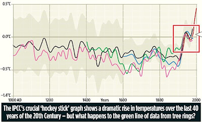
 And this excerpt from the article explains that the "hockey stick" graph: [w]as the chart displayed on the first page of the 'Summary for Policymakers� of the 2001 IPCC report - the famous 'hockey stick� graph that has been endlessly reproduced in everything from newspapers to primary-school textbooks ever since, showing centuries of level or declining temperatures until a dizzying, almost vertical rise in the late 20th Century.
There could be no simpler or more dramatic representation of global warming, and if the origin of worldwide concern over climate change could be traced to a single image, it would be the hockey stick.
Gabriel Fahrenheit did not invent the mercury thermometer until 1724, so scientists who want to reconstruct earlier climate history have to use 'proxy data� - measurements derived from records such as ice cores, tree-rings and growing season dates.
However, different proxies give very different results.
For example, some suggest that the 'medieval warm period�, the 350-year era that started around 1000, when red wine grapes flourished in southern England and the Vikings tilled now-frozen farms in Greenland, was considerably warmer than even 1998.
Of course, this is inconvenient to climate change believers because there were no cars or factories pumping out greenhouse gases in 1000AD - yet the Earth still warmed.
Some tree-ring data eliminates the medieval warmth altogether, while others reflect it. In September 1999, Jones�s IPCC colleague Michael Mann of Penn State University in America - who is now also the subject of an official investigation --was working with Jones on the hockey stick. As they debated which data to use, they discussed a long tree-ring analysis carried out by Keith Briffa.
Briffa knew exactly why they wanted it, writing in an email on September 22: 'I know there is pressure to present a nice tidy story as regards "apparent unprecedented warming in a thousand years or more".� But his conscience was troubled. 'In reality the situation is not quite so simple - I believe that the recent warmth was probably matched about 1,000 years ago.�
* * *
* * *
Finally, Briffa changed the way he computed his data and submitted a revised version. This brought his work into line for earlier centuries, and 'cooled� them significantly. But alas, it created another, potentially even more serious, problem.
According to his tree rings, the period since 1960 had not seen a steep rise in temperature, as actual temperature readings showed - but a large and steady decline, so calling into question the accuracy of the earlier data derived from tree rings.
This is the context in which, seven weeks later, Jones presented his 'trick� - as simple as it was deceptive.
All he had to do was cut off Briffa�s inconvenient data at the point where the decline started, in 1961, and replace it with actual temperature readings, which showed an increase.
On the hockey stick graph, his line is abruptly terminated - but the end of the line is obscured by the other lines.
'Any scientist ought to know that you just can�t mix and match proxy and actual data,� said Philip Stott, emeritus professor of biogeography at London�s School of Oriental and African Studies.
'They�re apples and oranges. Yet that�s exactly what he did.�Click here for the full article.
Most of the articles on global warming and climate-gate make for dense reading. They are not especially illuminating. Yesterday, though, I found an informative article, written in words I could understand.
The graph below, taken from an article in the UK Daily Mail, shows the mysterious hockey stick.
And this excerpt from the article explains that the "hockey stick" graph: [w]as the chart displayed on the first page of the 'Summary for Policymakers� of the 2001 IPCC report - the famous 'hockey stick� graph that has been endlessly reproduced in everything from newspapers to primary-school textbooks ever since, showing centuries of level or declining temperatures until a dizzying, almost vertical rise in the late 20th Century.There could be no simpler or more dramatic representation of global warming, and if the origin of worldwide concern over climate change could be traced to a single image, it would be the hockey stick.
Gabriel Fahrenheit did not invent the mercury thermometer until 1724, so scientists who want to reconstruct earlier climate history have to use 'proxy data� - measurements derived from records such as ice cores, tree-rings and growing season dates.
However, different proxies give very different results.
For example, some suggest that the 'medieval warm period�, the 350-year era that started around 1000, when red wine grapes flourished in southern England and the Vikings tilled now-frozen farms in Greenland, was considerably warmer than even 1998.
Of course, this is inconvenient to climate change believers because there were no cars or factories pumping out greenhouse gases in 1000AD - yet the Earth still warmed.
Some tree-ring data eliminates the medieval warmth altogether, while others reflect it. In September 1999, Jones�s IPCC colleague Michael Mann of Penn State University in America - who is now also the subject of an official investigation --was working with Jones on the hockey stick. As they debated which data to use, they discussed a long tree-ring analysis carried out by Keith Briffa.
Briffa knew exactly why they wanted it, writing in an email on September 22: 'I know there is pressure to present a nice tidy story as regards "apparent unprecedented warming in a thousand years or more".� But his conscience was troubled. 'In reality the situation is not quite so simple - I believe that the recent warmth was probably matched about 1,000 years ago.�
* * *
* * *
Finally, Briffa changed the way he computed his data and submitted a revised version. This brought his work into line for earlier centuries, and 'cooled� them significantly. But alas, it created another, potentially even more serious, problem.
According to his tree rings, the period since 1960 had not seen a steep rise in temperature, as actual temperature readings showed - but a large and steady decline, so calling into question the accuracy of the earlier data derived from tree rings.
This is the context in which, seven weeks later, Jones presented his 'trick� - as simple as it was deceptive.
All he had to do was cut off Briffa�s inconvenient data at the point where the decline started, in 1961, and replace it with actual temperature readings, which showed an increase.
On the hockey stick graph, his line is abruptly terminated - but the end of the line is obscured by the other lines.
'Any scientist ought to know that you just can�t mix and match proxy and actual data,� said Philip Stott, emeritus professor of biogeography at London�s School of Oriental and African Studies.
'They�re apples and oranges. Yet that�s exactly what he did.�Click here for the full article.
Labels: Climategate, Hockey Stick, Leaked Emails, Russia